Although I usually paint landscapes and city streets in watercolor, I’m especially drawn to the challenge of interior scenes. There are moments when a room or indoor space captures my attention so strongly that I feel compelled to paint it.
However, painting interiors requires a slightly different mindset and some adjusted watercolor approaches compared to outdoor subjects.
Watercolor Tutorial: Painting Interior Spaces
Interior scenes often feel more intimate than landscapes or urban views. They can reveal daily life, historical atmosphere, and the emotional connection between people and their surroundings.
Unique Difficulties of Interior Painting
While interiors bring their own challenges, my overall painting process doesn’t change dramatically. To show this, I’ll walk through how I approach an interior watercolor, highlighting key decisions along the way.
Drawing Stage for Interior Watercolors
The drawing phase is especially important when painting interiors.
Although sketching matters in every watercolor painting, interiors demand a higher level of accuracy. Unlike natural landscapes, which often have soft, irregular shapes that allow flexibility, interior spaces rely heavily on straight lines and precise perspective.
Because of this, there is less room for error. Taking extra time to refine the drawing before painting is essential.
It is also important to think about the message of the scene. Are you trying to express warmth and comfort? Architectural grandeur? Or the relationship between people and their environment? This intention will guide your compositional decisions.
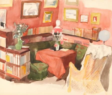
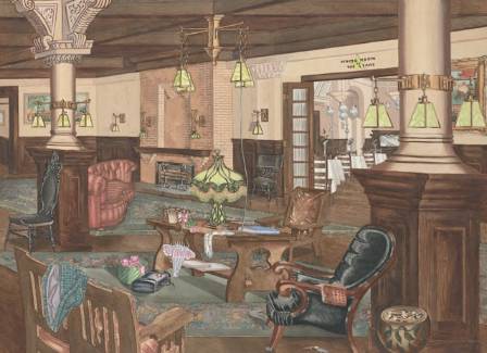
In my own painting, I wanted to highlight the beauty of a remarkable building and capture the warm atmosphere created by light and craftsmanship. To do this, careful attention to structure and perspective was necessary.
Tools like rulers and erasers are completely acceptable—and often very helpful—when refining accuracy.
Once the drawing is complete, I sometimes wet both sides of the paper. This extends working time during early washes, allowing pigments to blend more freely and naturally.
Handling Light in Interior Watercolors
The first wash focuses on the lightest values. In interior scenes, light is always the most important element.
Once darker tones are added later, it becomes difficult—sometimes impossible—to restore brightness. For that reason, preserving light from the beginning is critical.
Interior lighting is also more complex than outdoor light. There may be a combination of natural daylight and artificial illumination. In my cathedral painting, for example, stained glass windows strongly influenced the entire lighting environment.
Understanding Mixed Light Sources
One reason I was drawn to this scene was the contrast between cool and warm light. The window light was cool in tone, while the interior lighting was much warmer. This interaction created a visually interesting atmosphere that I wanted to explore.
During the initial wash, I placed stronger colors into the stained glass area while the paper was still wet, allowing them to soften naturally into the surrounding light wash.
I also observed that colored light from the windows reflected onto surfaces such as pews and floors, so I subtly added those tones into the foreground as well.
At this stage, I constantly refer back to my reference image and remain attentive to all light sources—natural, artificial, and indirect reflections.
After completing this layer, I let the paper dry fully before moving on.
Building Midtones and Structure
Even during the midtone stage, I continue thinking about light. For example, when painting architectural elements, I leave areas untouched where light would naturally fall.
I generally work across the composition in a structured direction, carefully balancing warm and cool hues. Warm tones like raw sienna help create depth and atmosphere, while cooler colors such as cobalt blue, lavender, and neutral tint add contrast and shadow variation.
One of the main difficulties in this stage is maintaining strong contrast without losing clarity. To solve this, I sometimes lift pigment using a clean, damp brush, softening areas to preserve luminosity.
I continue layering midtones gradually, adjusting figures, furniture, and light interactions across the space.
Developing Focus in the Interior Scene
The final stage involves dark values, fine details, and strengthening the composition.
At this point, I also determine the focal point of the painting. The area of highest contrast and detail naturally attracts attention, so everything else should support it visually.
In this painting, the focal area is a figure positioned near a detailed architectural structure. I use surrounding elements to guide the viewer’s eye toward this moment.
As I add smaller details, the foreground becomes more prominent, while the background begins to recede—creating depth and hierarchy within the scene.
Avoiding Over-Detailing
Interior environments often contain many intricate elements such as arches, carvings, and patterns. A major challenge is resisting the urge to paint everything exactly as it appears.
Overworking every detail can make the painting feel cluttered and reduce clarity. Instead, it is better to suggest forms rather than fully define them.
Squinting at the reference image helps simplify values and shapes, making it easier to decide what is essential and what can be implied.
With experience, you begin to understand how to balance detail and simplicity to maintain a strong visual impression.
Final Thoughts
And that completes the painting.
Interior watercolor scenes are both enjoyable and deeply rewarding. They offer endless subject possibilities and unique lighting challenges. I hope these insights help guide you in your own interior painting practice, and encourage you to explore this fascinating subject further.