Capturing the natural world through watercolor is a pursuit defined by an appreciation for atmospheric clouds, the nuances of natural light, and the rhythmic transition of the seasons. The outdoors offers infinite inspiration, but translating the vastness of a three-dimensional environment onto a flat sheet of paper requires a strategic approach. To emulate the beauty of the world effectively, artists must master the balance between technical skill and thoughtful preparation.
1. Map Out Your Scene Before Applying Paint
A successful landscape begins with a deliberate plan. This starts with a light pencil sketch, which functions as a roadmap for the entire creative process. By referencing a photograph or a live scene, you can establish the placement of major forms and identify the primary focal points of your composition.
When sketching the sky, minimal detail is required—perhaps just a few soft guidelines to provide structure for cloud formations. However, for the middle values and darker regions of the land, drawing more defined lines is beneficial. These darker marks remain visible even after the initial wash, ensuring you don't lose your placement as the painting develops.
Determining the Primary Focus
A critical decision in the planning phase is deciding whether the sky or the ground holds more importance. Generally, a landscape is anchored by whatever captivated you first—be it the glow over a distant ridge or the colors of a seasonal meadow. To allow this main idea to flourish, avoid placing the horizon line exactly in the center of the page. Instead, position it in the upper or lower third of the frame to give the most interesting element room to shine.
Implementing the Rule of Thirds
The "Rule of Thirds" is a classic compositional tool used to create balance and direct the viewer's eye. By imagining a grid that divides the paper into nine equal sections, you can place key areas of interest at the points where the lines intersect. While this isn't a rigid law, favoring one of these vertical or horizontal thirds typically results in a more compelling and harmonious arrangement.
2. Develop a Methodical Painting Guide
Because watercolor is a medium of transparency and timing, planning the order of operations is essential. A common and effective strategy is to work from the lightest values to the darkest. Identifying which elements belong to the first, second, and third washes prevents the colors from becoming muddy or overworked.
In most scenarios, the sky represents the lightest value and is handled in the first wash. Notable exceptions include snow-covered landscapes, where a deep blue sky might actually be darker than the white ground. Additionally, the illuminated sides of buildings or patches of sunlit grass should be accounted for in the initial light wash. Documenting these steps in a physical list can alleviate stress during the painting process and keep the artist focused on the original vision.
3. Leverage Tools for Atmospheric Perspective
The primary challenge for a landscape artist is to create the illusion of vast distance on a thin substrate. This sense of depth is achieved through the strategic use of three specific tools: edge, color, and contrast.
Edge and Texture
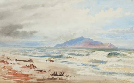
The clarity of a shape’s boundary dictates its perceived distance. Sharp, hard edges and intricate textures pull objects toward the foreground. Conversely, soft, blurred, and nondescript edges push elements into the background. A powerful watercolor technique involves placing a crisp, dark mark—such as a sharp tree branch—over a soft, hazy background. This juxtaposition immediately establishes a clear sense of space.
Color Temperature
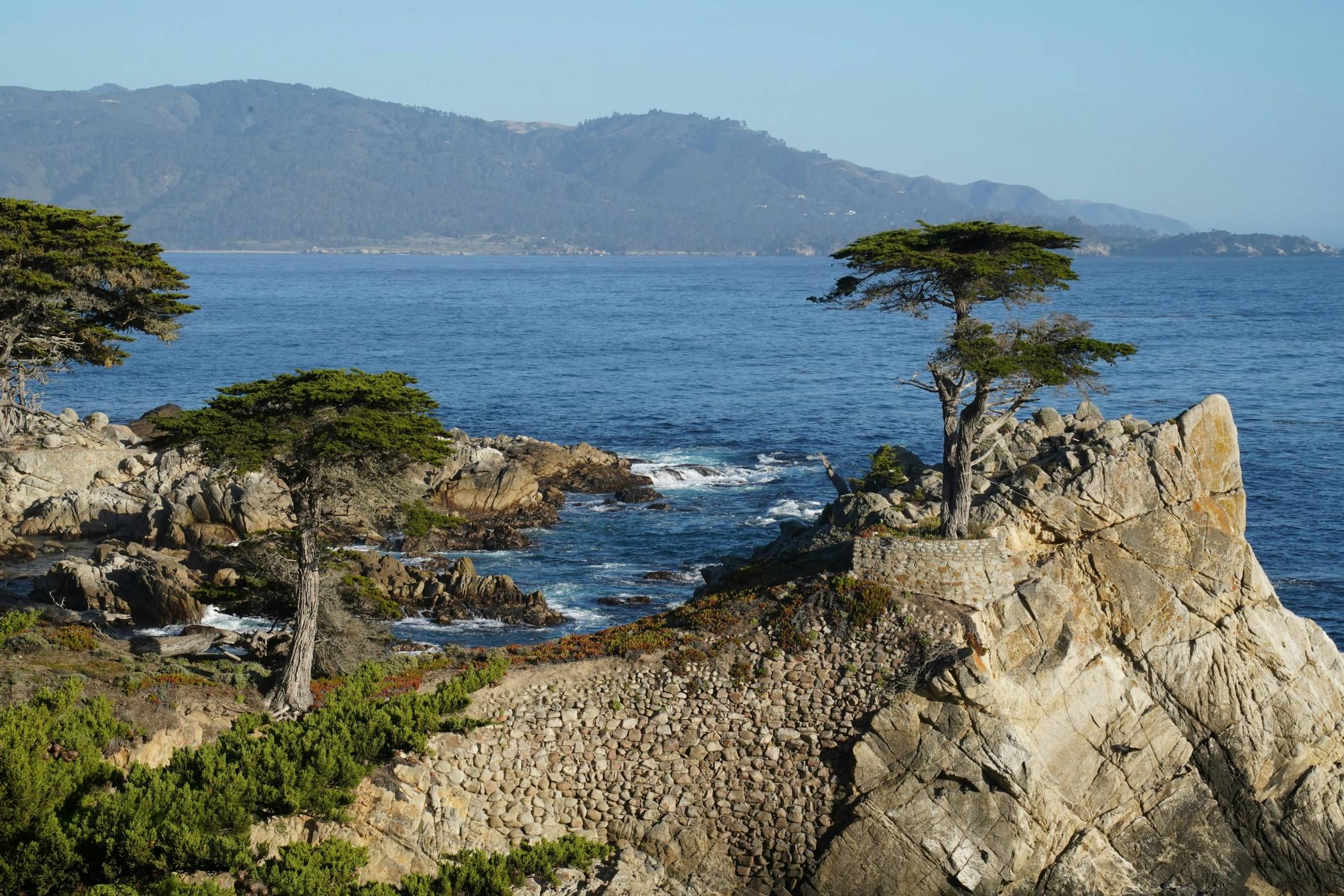
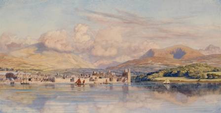
Color plays a significant role in atmospheric perspective. Cooler tones, particularly those in the blue spectrum, tend to recede into the distance. Warmer, more saturated tones advance toward the viewer. For example, when painting a series of hills, adding a touch of blue to the distant foliage creates the "haze" of distance, while using warmer, more vivid greens in the foreground brings the meadow closer.
Contrast and Value
Contrast refers to the degree of difference between light and dark areas. High contrast—placing deep shadows directly next to bright highlights—commands attention and appears closer. As elements move toward the horizon, the level of contrast should diminish. Reducing the range of values in the background helps maintain the illusion of a vast, receding landscape.
4. Group Forms to Avoid Overworking
One of the most common pitfalls in landscape painting is the attempt to render every individual leaf or twig. While we know that distant trees are composed of thousands of branches, attempting to paint each one destroys the sense of depth and leads to an "overworked" appearance.
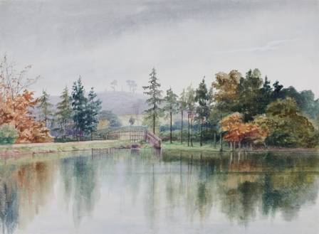
A master watercolorist learns to see the landscape as a collection of large, unified shapes. By squinting at a scene, intricate details disappear, leaving behind solid blocks of value. Painting a grove of trees as a single, cohesive shape—and then adding just a few strategic details once it is dry—allows the viewer's mind to fill in the rest. This ability to simplify and group information is what keeps a painting fresh, airy, and professional.
Summary of Landscape Success
By integrating these four strategies—pre-planning the scene, outlining the wash process, utilizing the tools of depth, and simplifying complex shapes—you can transform your watercolor practice. These methods ensure that your landscapes are not just depictions of nature, but immersive experiences filled with light and dimension.