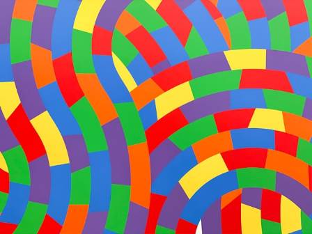
Color blocking is a creative technique found in visual arts, fashion, interior design, and other creative areas. It involves placing large, distinct areas of color next to each other to build a visually appealing composition. This method emphasizes the contrasts and harmonies between bold color segments.
Color blocking can be used in painting, sketching, digital design, photography, and more. With practice, mastering this approach can elevate your artwork to a whole new level.
What is Color Blocking?
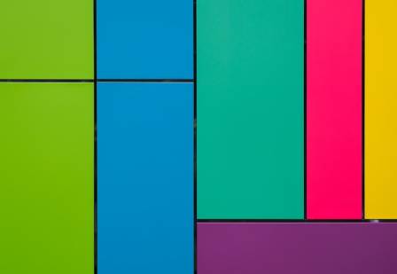
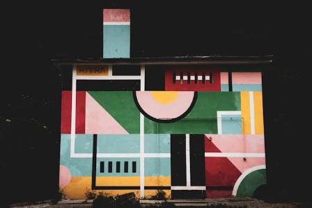
Color blocking means filling defined areas with solid colors rather than blending or shading. The aim is to create bold, noticeable sections that capture attention. This method relies on strong visual contrast and clarity. When done well, it results in striking and memorable works.
Historically, color blocking emerged in the early 20th century. Artists such as Piet Mondrian popularized it with geometric layouts using thick black lines and primary color blocks. Today, color blocking is widely applied in abstract art, representational pieces, graphic design, quilting, fashion, and interior decoration.
Why Use Color Blocking?
Artists and designers turn to color blocking for several reasons:
Draws attention: Strong color sections naturally guide the viewer’s gaze.
Highlights shape and form: Color boundaries help define contours and structures.
Adds visual contrast: Alternating colors create excitement and energy.
Conveys movement: Color intersections can suggest rhythm or flow.
Injects vibrancy: Bright, contrasting blocks create lively, dynamic compositions.
This approach can suit both minimalist and maximalist aesthetics, depending on how it’s applied.
Choosing a Color Palette
Selecting colors carefully is essential for effective color blocking. The right palette should balance harmony and contrast. Tips include:
Limit your choices to 2–5 colors for the clearest impact.
Use a color wheel to pick complementary or triadic combinations.
Stick to shades of one hue for a cohesive effect.
Pair bright colors with neutrals or black-and-white for visual punch.
Consider the context or theme to guide color selection.
Test different combinations until the palette feels balanced. Boldness is key, but not every color needs to be highly saturated.
Creating a Color Block Composition
Once your colors are chosen, experiment with arranging them in blocks. Some tips:
Layer overlapping blocks for depth.
Repeat colors to unify the composition.
Use various shapes, not just squares—triangles, circles, and irregular forms work well.
Leave negative space for contrast.
Align edges carefully for consistency.
Sketch thumbnails first to plan your arrangement and maintain visual balance. Let some colors dominate while others take a supporting role.
Color Blocking in Different Mediums
Color blocking can be adapted to many mediums:
Painting: Acrylics or oils are perfect. Avoid blending, and use tape for crisp edges.
Drawing: Colored pencils, markers, or pastels work well. Keep outlines minimal.
Graphic design: Vector software allows precise geometric blocks and overlapping shapes.
Textiles: Use solid-colored fabrics in quilting, weaving, or clothing patterns.
Photography: Capture large areas of color in nature or urban scenes, and enhance with editing.
Inspiration for Color Blocking
Studying notable artists and designers can spark ideas:
Piet Mondrian – abstract compositions with primary color blocks
Matisse – bold cut-paper collages
Seth Armstrong – modern optical color block paintings
Alma Woodsey Thomas – expressive stripe works
Charley Harper – minimalist nature illustrations
Paul Smith – fashion designs featuring vivid color blocks
Alexander Girard – vibrant textile patterns
Iwan Semitkow – constructivist color-block paintings
Look to art, design, and everyday environments for new ways to experiment.
Tips for Successful Color Blocking
Start with just 2–3 colors or shapes.
Don’t aim for perfection; irregular shapes add interest.
Study masterworks for inspiration.
Test ideas with small sketches before larger works.
Use color theory to guide complementary or analogous choices.
Play with scale—mix large and small blocks.
Keep edges clean for a polished look.
Conclusion
Color blocking is a dynamic technique that uses contrast to make art visually compelling. Understanding color relationships helps in choosing striking palettes. By arranging colors in clear blocks, artists can create bold and expressive pieces. Whether in painting, drawing, digital design, textiles, or photography, color blocking adds energy and vibrancy. With practice, experimentation, and awareness of color theory, anyone can use this technique to bring bold flair to their creative projects.